II. Placed In the Right Place: Raymond Saunder's Moments of Narrative
- Ely Gann
Identity in art is a nuanced subject matter communicated either through narrative structure, documentary techniques, political semiotics, abstraction, or a collage of these methods. Generally, an exhibition including work by marginalized artists focuses on the narrative or representative methods, but the reductive implications of this practice excludes an innumerable portion of artists while at the same time alienating them in otherness. Raymond Saunders is an artist and a Black man. The identity of every artist is inherently present in their work, but to suggest that Black identity solely defines one’s work is a folly. His criticism of the vexed generalization of Black artists explains how this forces their excursive perspectives into obsolescence. In an interview with Cultural Weekly, he states: “I am an Artist. I do not believe that artwork should be limited or categorized by one’s racial background. […] I love black as a color, I can make it sing with just placing something in the right place.”1
Profile in Time by Saunders fits the aesthetic of much of his work. (Figure 4) There are nods to formal composition in the residual evidence of numbered marks dividing the center rectangle of the piece. Found scraps of paper are intentionally arranged in the piece, providing dynamic islands in distinct fields of primary colors. He uses found material as a narrative anchor for the viewer, while still maintaining the gestural abstraction that defines his oeuvre.2 The multiple materials and colors, composition styles and concepts re-enforce the need for visual analysis with an expansive periphery. His work challenges the idea that identity is at the forefront of conceptual development for visual art and allows it, instead, to exist as a tempo guiding the artist’s hand and the work’s resolution.
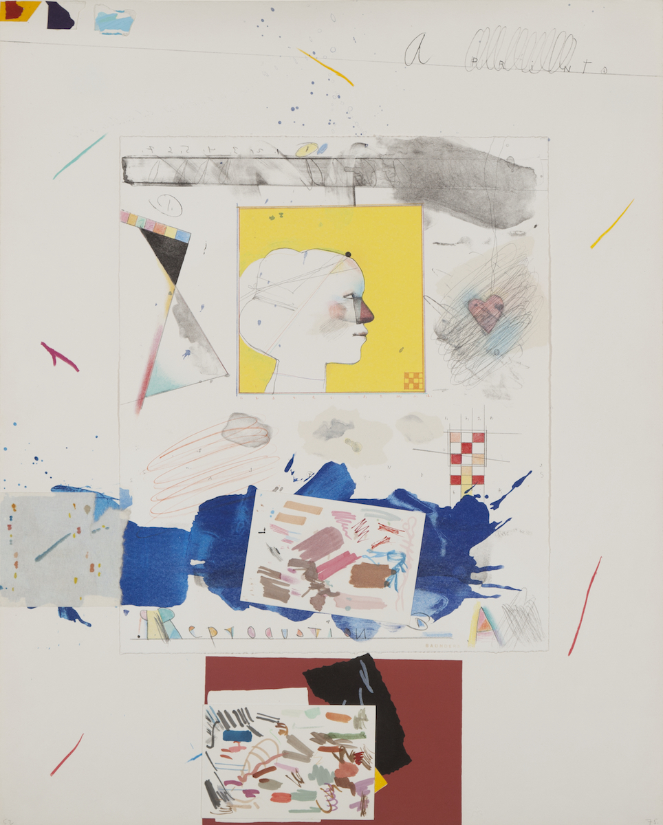 Figure 4
In 1967, Saunders penned a piece entitled Black is a Color in critical response to an article by Arts Magazine in which Ismael Reed “‘documents’ the ‘explosive black arts movement’.”3 The problem here lies in the aforementioned reductive qualities inherent in claiming to exalt a group of artists by arbitrary convergence of their diverse works, held in common only by the identity of the individual artists. The method used by Reed is superficial—in his othering of Black artists, he separates their work from art as a whole.4 It was not only a common mistake in the art world in the decade of this essay’s creation, it has continued in the categorization of many marginalized artists’ works to today. The specificity of identity is still used as a marketing tool for galleries and museums—shows may be publicized in attempts to adorn some sort of new-found radical acceptance of those generally not allowed in spaces of “high” art.
Museums are now working harder to prove their shift toward diversity, including deaccessioning work by white artists to be replaced by works of marginalized artists. This is certainly a positive outcome of the trend, but, a gesture that must be followed with a shift in perspective of how we categorize these works. While art institutions are performing these acts of retribution, they should be held accountable for the decades that they have not included canonical Black and Brown artists through the course of history, and must make it a point to group these works as they do those by white male artists: stylistically, temporally, and by the content of the work itself rather than the identity of its creator.
State of Convergence is an attempt to reconcile this common blunder by featuring marginalized artists of the Bay Area in an expansive way, covering work focusing on indigenous ceremony, immigration, gender, community, and white gentrification depicted in myriad techniques and contexts. The focus here is specific to the individual styles rather than identity alone. The fact cannot be changed that representation of artists of color has been sparse, overworked or commodified when offered by most art institutions. It is imperative to repair this, in part, by largely featuring work by artists outside of the white cis-male identity and to do so without a self-aggrandizing display of inclusive politics. So, in the “converging” of these works, we stress the attention to the span of concept, material, and style. Rather than forcing a connection based on the identity of the artists included—focus on perspective shifts, prioritize motifs and the multiple purposes of these pieces.
Profile in Time was chosen for State of Convergence because of its multiplicity of form and content. Saunders’ confident gestures and fields of color formed from collaged paper, ink, graphite, paint and pastel appear effortless in their placement amongst the intentional negative space and offer a range of style, texture and form to digest. It’s one of the few pieces Saunders made with a white background, which he claims: “On a white canvas the thing can fall down or has to be supported, because it’s empty. It’s not a presence.”5 His collage of color and texture has done the work to support the suggested emptiness of a white background, and further demonstrates Saunders’ ability to bypass identity in creation and still summon a recognizable personal narrative in his finished pieces. Though he chose the challenge of a vacant white background, there is a living quality to this piece. Each differentiated color field divides a continuous narrative and retains an allure of obscurity—we are given access only to fragments of a story, the rest left to the imagination.
At the top of this print, he has written “A Print” in adolescent cursive, which cheekily suggests ubiquity and is placed directly across from three shapes transforming linearly from rigid to curved, containing the primary colors repeated throughout the piece. This is all atop a thin diagonal line, while below we see the same handwriting in a straight, rectangular boundary mimicking the format of children’s handwriting practice books with the repetition of the letter ‘a’ backwards and forwards. The mirroring of numbers and letters seems an obvious nod to reflection, then combined with the letters of Saunders’s last name stippled in much of the negative space, and the word “reproduction” substantially present in the lower right corner, the images begin to circumscribe more. Reflection is one piece—specifically a reproduction of self-reflection—once removed from our own perception.
A figure’s head with a multi-colored face (a smaller scale of the repetitive scheme of the complete piece), resides in a clean yellow square with thin strings bounding and bow-tied around its crown. A diagonal line separates the face and resembles a head scarf, and another division of thin lines cross through the neck. The figure stares complacently, either ending its gaze at its residential boundary, or looking beyond to a heart scribbled over, but prominent in color and size. Because of his arrangement of composition one is able to consider the motion of each individual piece, Saunders’ hand rearranging each component until finding its subsequent resting place. His work has a proclivity for forthcoming imagery amongst a cool, detached tenor; it rouses a casual magnetism with its individuality and resourceful process.
Saunders’ work is an important example of artwork by Bay Area artists. His essay “Black is a Color” was written in 1967, concurrent with the rise of white male Abstract Expressionism on the East Coast. During that period, artists on the West Coast and artists of color were overlooked, their technique and content presumed irrelevant by many critics of the time.6 His work entails the same lean towards spiritual experience in a distinctive way, and while Saunders was successful he was still not as recognized as his contemporaries. White painters at the time were primarily Abstract Expressionists, while Saunders and other expressionist painters of color were immediately subdivided by identity and not considered in the same critical analysis as their white peers. White artists are not faced with the identity-based separation and therefore dominate the canonical movements throughout art history. It is clear for artists like Saunders that race dominated bifurcation has the tendency to overlook content entirely, a frustration he constantly vocalized but was continuously unnoticed.
In the midst of improvement in diversity and inclusion in art spaces, consideration of this history is incumbent to accomplishing the normalization of art by people of color in white-dominated collections. The work included in State of Convergence is but a survey of marginalized Bay Area artists, and seeks to exemplify their stylistically distinct properties while recognizing identity and its function in an artist’s practice. The constant reference to racial identity inherently obfuscates “what runs through all art—the living root and the ever-growing aesthetic record of human spiritual and intellectual experience […]”7 Saunders’ work unapologetically dismisses the stereotype relentlessly thrust upon him as a Black artist. Convergence is a tool to be used consciously—we were never a melting pot, more like an ongoing summation of equipotent parts.
- “Raymond Saunders: Seen and Unseen,” Cultural Weekly, September 23, 2015. Accessed October 1, 2019, https://www.culturalweekly.com/raymond-saunders-seen-and-unseen/ ↩
- Ibid. ↩
- Darby English, 1971: A Year in the Life of Color (Chicago: University of Chicago Press, 2016), pp. 266-276. ↩
- Raymond Saunders, “Black is a Color,” 1967, reprinted in 1971: A Year in the Life of Color, p. 266, https://www.janvaneyck.nl/site/assets/files/2312/r_saunders.pdf ↩
- “Raymond Saunders: Seen and Unseen.” Cultural Weekly. ↩
- Jordana Moore Saggese, “The Pleasures and the Perils of Abstraction,” The International Review of African American Art Plus, 2012. Accessed November 13, 2019,
http://iraaa.museum.hamptonu.edu/page/The-Pleasures-and-the-Perils-of-Abstraction. ↩ - “Raymond Saunders: Seen and Unseen.” Cultural Weekly. ↩